|
Replies: 30
| visibility 1
|
Orange Blooded [3981]
TigerPulse: 91%
Posts: 5094
Joined: 8/23/16
|
National Championship logo
Jun 24, 2017, 8:32 PM
|
|
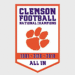
Am I the only person that thinks our national championship logo looks like crap? I have of course bought the merchandise but the more I look at it the more weak it looks
|
|
|
|
 |
CU Guru [1261]
TigerPulse: 99%
Posts: 1994
Joined: 4/28/14
|
Re: National Championship logo
Jun 24, 2017, 8:37 PM
|
|
Agree it could look better used to not like it at all but it's grown on me lol
|
|
|
|
|
|
Varsity [204]
TigerPulse: 100%
Posts: 83
Joined: 1/23/16
|
Re: National Championship logo
Jun 24, 2017, 8:40 PM
|
|
I hate to concur but....(slightly blasphemy)....... I love it!!!! ..........(But it could've been juuuuuuust a little better)........no I'll love it. CHAMPS BABY
|
|
|
|
|
|
CU Guru [1197]
TigerPulse: 100%
Posts: 1362
Joined: 2/19/15
|
Re: National Championship logo
Jun 25, 2017, 8:19 AM
|
|
Concur means agree
|
|
|
|
|
|
110%er [9065]
TigerPulse: 94%
Posts: 13819
Joined: 7/1/02
|
I can't stand it - looks cheap and tacky***
Jun 24, 2017, 9:04 PM
|
|
|
|
|
|
|
|
All-TigerNet [12547]
TigerPulse: 86%
Posts: 12248
Joined: 11/21/11
|
I never liked the idea of a single logo being "the national
Jun 24, 2017, 9:13 PM
|
|
championship logo". At first I thought it was the city of Tampa's logo for the national championship. Then I found out it was designed by a Clemson student. I wasn't a huge fan of it, but it is in line with the last few logos for national champs like Glendale, etc., something I didn't even know was a thing until we won. I have bought a ton of national championship merchandise. Some items have it some don't. I never bought something where that was the main thing, but on a lot of things it is on them. I probably will buy a white football and that is the main thing on that, but it also has the game score and schedule.
Bottom line, like someone said before, it has grown on me. I bought a hat that was the best has because it said Clemson and national champ and year on the front. On the side very small is that logo. It doesn't bother me. As time goes by, I'm sure we will all grow more fond of it as it is something that will always remind me of this great event. Bottom line, you can shop around it, or get plenty of good items with it as a side view. I sure hope they don't make that logo the stadium commemoration to the championship though. I hope we do something more along the line of FSU with their national championship signage within the stadium.
In the end, it has grown on me. And bottom line, you know you're having a good year when the big complaint is your national championship logo!!!
Go Tigers!
|
|
|
|
|
|
Orange Blooded [3981]
TigerPulse: 91%
Posts: 5094
Joined: 8/23/16
|
Re: I never liked the idea of a single logo being "the national
Jun 24, 2017, 9:21 PM
|
|
I agree in the sense I will wear anything that says Clemson and National Champion on it. Gamecock wife I think is growing tired of it
|
|
|
|
|
|
All-TigerNet [12547]
TigerPulse: 86%
Posts: 12248
Joined: 11/21/11
|
Yes, I can imagine. One other note, the logo for Bama's win
Jun 25, 2017, 12:00 PM
|
|
in Glendale is really plain. It doesn't even say Alabama. It has a big A and then crimson tide on it some where and it is almost completely red. It does have a cactus or two, which I think are cool because of the Arizona landscape. Ours has palm trees I guess for Tampa or maybe our state, but I think Tampa.
|
|
|
|
|
|
Rock Defender [54]
TigerPulse: 90%
Posts: 35
Joined: 11/30/98
|
Re: Yes, I can imagine. One other note, the logo for Bama's win
Jun 25, 2017, 1:44 PM
|
|
The palm trees represents the fact that both of Clemson's national titles were won in the state of Florida.
|
|
|
|
|
|
All-TigerNet [12547]
TigerPulse: 86%
Posts: 12248
Joined: 11/21/11
|
That's cool***
Jun 25, 2017, 7:08 PM
|
|
|
|
|
|
|
|
Orange Blooded [2989]
TigerPulse: 96%
Posts: 7583
Joined: 7/19/01
|
|
|
|
|
|
Orange Blooded [3981]
TigerPulse: 91%
Posts: 5094
Joined: 8/23/16
|
Re: National Championship logo
Jun 24, 2017, 9:22 PM
|
|
Yes! Looks much better in orange and white. Still don't like it really but much better
|
|
|
|
|
|
CU Medallion [67853]
TigerPulse: 100%
Posts: 115485
Joined: 11/30/98
|
Re: National Championship logo
Jun 24, 2017, 9:46 PM
[ in reply to Re: National Championship logo ] |
|
yep this move to regalia is bs. first is basically a made up color. our official color is northwestern purple. It is much darker and more regal looking. Like the color Crown Royal uses
|
|
|
|
|
|
CU Medallion [57161]
TigerPulse: 100%
Posts: 39702
Joined: 11/12/04
|
it *used* to be northwestern purple. and burnt orange. And white.
Jun 25, 2017, 1:30 AM
|
|
Officially, it is now Regalia, Clemson Orange, and Fort Hill, but I get where you are coming from.
https://www.clemson.edu/brand/guide/color.html
|
|
|
|
|
|
Orange Blooded [2989]
TigerPulse: 96%
Posts: 7583
Joined: 7/19/01
|
I think starting in the 1970's, the purple was used less
Jun 25, 2017, 2:40 PM
|
|
in football, maybe athletics (kind of turned to a navy blue in basketball), but appeared again later on academic stationary.


http://media.gettyimages.com/photos/forward-elden-campbell-of-the-clemson-tigers-shoots-the-ball-during-a-picture-id298015
One might notice that the donor athletic paper was named the Orange and White during that period. Most people seemed to like that better. When I was a kid, I don't remember the North and the South Stands yelling "Orange" and "Regalia" back and forth. *L*
However, I do remember around the time of the Clemson Centennial in 1989 that the president at the time Max Lennon, unveiled a new banner similar to this one:
http://clemson.bncollege.com/webapp/wcs/stores/servlet/18x24_Rafter_Banner/ProductDisplay?parentCatId=40364&imageId=980446&level=&graphicId=RV150818&categoryId=40414&catalogId=10001&langId=-1&storeId=13558&productId=400000085667&topCatId=40350
It brought back the purple briefly, as did the athletic department during the Tommy Bowden era, early 2000's with purple unis and pants. Don't really miss the pants as I recall.
|
|
|
|
|
|
All-TigerNet [10924]
TigerPulse: 100%
Posts: 12720
Joined: 9/28/10
|
|
|
|
|
|
Orange Blooded [4359]
TigerPulse: 89%
Posts: 3717
Joined: 2/21/05
|
Re: National Championship logo
Jun 24, 2017, 10:34 PM
|
|
Agree...it sucks.
|
|
|
|
|
|
CU Medallion [64593]
TigerPulse: 100%
Posts: 88998
Joined: 3/27/01
|
It's a heck of a lot better than the one you don't win***
Jun 25, 2017, 8:03 AM
|
|
null
|
|
|
|
|
|
Orange Blooded [2683]
TigerPulse: 100%
Posts: 2751
Joined: 11/30/98
|
|
|
|
|
|
Orange Blooded [3405]
TigerPulse: 100%
Posts: 5216
Joined: 1/26/09
|
Re: National Championship logo
Jun 25, 2017, 10:04 AM
|
|
I don't understand the hate. I think it's a nice logo.
|
|
|
|
|
|
Orange Blooded [3405]
TigerPulse: 100%
Posts: 5216
Joined: 1/26/09
|
Re: National Championship logo
Jun 25, 2017, 10:09 AM
|
|
It looks a lot better than the last two championship logos for OSU and Alabama.


|
|
|
|
|
|
All-In [26346]
TigerPulse: 100%
Posts: 15328
Joined: 1/12/00
|
I love the thing. If it had two dogs humping on it I'd love
Jun 25, 2017, 10:34 AM
|
|
it if reminded me we won another NC every time I saw it.
|
|
|
|
|
|
All-In [38429]
TigerPulse: 100%
Posts: 33201
Joined: 7/28/11
|
Re: National Championship logo
Jun 25, 2017, 10:47 AM
|
|
Maybe we should give it all back then .
How dare a Clemson group help design our own national championship logo and do such a poor job , according to some .
|
|
|
|
|
|
Legend [15492]
TigerPulse: 100%
Posts: 18413
Joined: 12/10/14
|
Re: National Championship logo
Jun 25, 2017, 1:30 PM
|
|
You are not the only person. When I first saw it I was shocked.
It looked like it was designed using basic software from the 80's.
It's pleasant enough....sort of back of a cereal box, 2 color drawing similar to a Fanta Orange Soda advertising.
I would have prefered a more Rolls Royce/Brooks Brothers classy thingy like our media department typically comes up with.
I thought this one was nice:

And this one:

|
|
|
|
|
|
110%er [9325]
TigerPulse: 100%
Posts: 13045
Joined: 8/14/00
|
Would have liked to have seen this one too
Jun 25, 2017, 4:09 PM
|
|

|
|
|
|
|
|
CU Medallion [51550]
TigerPulse: 100%
Posts: 43083
Joined: 8/10/04
|
I love it***
Jun 25, 2017, 5:08 PM
|
|
|
|
|
|
|
|
Orange Blooded [4559]
TigerPulse: 100%
Posts: 4427
Joined: 7/14/03
|
It looks a bit cartoonish***
Jun 25, 2017, 5:32 PM
|
|
|
|
|
|
|
|
CU Medallion [51550]
TigerPulse: 100%
Posts: 43083
Joined: 8/10/04
|
Well it's an illustration, so...***
Jun 25, 2017, 7:36 PM
|
|
|
|
|
|
|
|
Team Captain [459]
TigerPulse: 56%
Posts: 1256
Joined: 12/29/16
|
Re: National Championship logo
Jun 25, 2017, 6:08 PM
|
|
|
|
Here are the three so far from the playoff era. They're all in the same family of similarity, but each have their own identity. I don't have a huge problem with it. I'd rather what we have than some obnoxious logo that everyone hates. This will still look classy in ten years.
|
|
|
|
|
|
All-TigerNet [12547]
TigerPulse: 86%
Posts: 12248
Joined: 11/21/11
|
Well, I definitely prefer ours to the others. I am bias, but
Jul 4, 2017, 6:40 PM
|
|
even if I wasn't I would think it is right in line with the others.
|
|
|
|
|
|
Commissioner [970]
TigerPulse: 100%
Posts: 2416
Joined: 4/2/10
|
Re: National Championship logo
Jul 5, 2017, 7:09 AM
|
|
I'm sure it will be tweeked a little for every subsequent natty. Maybe tnetters can have some input.
|
|
|
|
|
|
Replies: 30
| visibility 1
|
|
|